Regardless of your trading style, it is important that you analyse the same thing that you trade. That might sound obvious, but it is a very common error even among professionals. There are two main mistakes in this regard. To analyze the cash markets while trading the futures and to analyze a non-adjusted futures continuation. Both usually have large error factors over time but of different kind.
If you work with any sort of time series analysis it is of vital importance that you work with the correct series. It doesn’t matter how good your analysis is. If you’re basing it on flawed data, your result will not be accurate. Garbage in, garbage out.
The Basics
If you trade cash instruments, such as stocks, there is no problem. Well, there is a smaller problem caused by dividends but that’s a whole different article.
Futures, on the other hand, have a limited lifespan. Each contract represents delivery of an asset at a specific point in time. The price of the futures contract will almost always be different from that of the underlying asset. This has nothing to do with whether the market expects the price of the underlying asset to go up or down. This has everything to do with cost of carry. If you plot each successive delivery on a chart along with its price, you can visualize what’s called the market’s term structure. The normal state is that each successive point is a little higher than the previous. That’s called contango. If the curve is instead sloping down, that’s called backwardation. For many markets, the slope of this curve has a major impact on long-term prices.
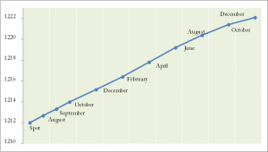
Chart: Example term structure.
An Example
The key thing to understand here is that most of us trade the futures or the CFDs based on the futures. Analyzing the time series of the spot then makes little sense. In the very short term, the difference may seem small. But that can be highly deceptive.
Let’s take an extreme market as a demonstration. Below, you see the term structure for natural gas as it looked a couple of months ago. The percentage differences between the points is quite large as you might notice. The way to think about these price difference is in terms of hedging. If you can hedge something, you can price it. So if you want to hedge the December natural gas, what would you do? Well, first borrow the cash and buy the physical gas. You’ll need to take the interest on that loan into account of course. Then you need to rent some storage facility were your gas can be until December. Given the density of this asset, quite large containers are required, usually underground silos. And of course you need to organize transport. Well, this kind of adds up and that’s a key reason for how the term structure has looked for natural gas for the past decade or so. Note that this situation has changed lately, which has major implications for how to analyze this asset.
Similar arguments can be made for many other commodities. For financial futures, the main input is the interest rate since there is no storage involved.
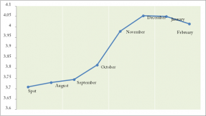 Chart: Term structure of natural gas (dated example, view current situation here). The gas is almost ten percent more expensive for December delivery than for spot. Here is an exercise for you: What would happen to the December futures price if the cash net gas price didn’t move at all from now until December?
If the cash price does not move in half a year, the December futures will slowly move down each day until in the end it hits the exact price of the cash market. Now the importance of term structure should start to be a little clearer. The steeper the structure, up or down, the larger the error factor in using cash series or poorly adjusted futures.
The Big Picture
Now let’s see how the long-term charts of natural gas looks, properly adjusted versus the cash market. If we assume that you’re not owning and operating pipelines and silos, the blue futures line is your reality. The red line is simply the illusion.
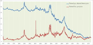 As the term structure of natural gas has remained steep for decades, it has put a significant negative pressure on the actual futures price. It may look almost unchanged. But that’s not the reality for traders.
If you look at financial markets, such as the S&P Index and you use reasonably short-term periods, the error factor can almost be disregarded. But even for these markets, you’ll see a longer term error that adds up. Compare properly adjusted futures continuation series with spot over the long run and you’ll see the difference.
So what about the standard continuations that come with most market data products? In most cases, they are even more flawed than using cash prices. Most data packages simply put one futures contract after the other and calls it a continuation. These series should never ever, under any circumstances, be charted or used for time series analysis. If you for example draw a trend line on a long term chart of CLc1 on ThomsonReuters or similar on other platforms, the error factor in your data will be so large that your line lacks all meaning. The same if you do indicators or other analytics on such series. These codes were never meant to be used as time series.
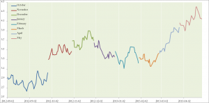 Why any analytics on simple continuations are useless
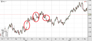
What you need to understand is what these simple continuations are and how they are made. The chart below illustrates this. These continuations just take one series after another, mixing different delivery dates and treating them like the same asset. They are not. Look at how the chart below starts with a blue line, representing in this case the October 2012 natural gas. When this expired, the simple continuations just plot the next contract. Without any adjustment. This gives the appearance of a gap in the price, where no such gap actually occurred in reality. The steeper the structure at any the roll time, the larger the artificial gap becomes.
This continuation is the simple kind, just a combination of different instruments on a single time axis. Notice how it introduces artificial gaps, just as the previous chart would predict.
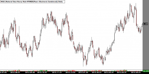
 Now compare with what an actual trader in the natural gas market would have experienced for the same time window. This time series is a proper continuation, where the artificial gaps have been removed. This series is made to resemble the real experiences of a trader, choosing the most liquid contract, rolling with open interest and removing the artificial gaps.
If you compare the overall move of the actual futures market in this time with what a simple continuation shows, you see two very different pictures. If you had drawn trend lines or applied any indicators on this, they would be as irrelevant as the data series itself. Looking at the simple continuation, you might get the impression that a bull market is going on. This is just an illusion created by market structure.
 What you can do
Analyze what you trade. Trade what you analyze. Unless you’re very short term, don’t look at cash and trade the index. And regardless of your time horizon: Never, ever use simple continuations.
If you base your analysis on more than a month or two of data and you trade the futures or instruments based on the futures, you need to make sure you get proper time series.
After all, what’s the point of doing hard analytic work if your core input factor was flawed in the first place?
I will write more on this subject in the coming weeks. There’s much to be gained from understanding term structure and it’s implications. Meanwhile, you can view the current and continuously updated term structures for a wide range of markets right here.
 Following the Trend


Hi Andreas,
I would like to know one thing. For instance, I tried to apply your system in your book on SIK15 chart. Should I use single contract or continue? If I choose a a 100-day ATR, the value is different for single contract and for continue, however, the difference is mere.
I have been using Barchart for data over 20 years. However, they use 3 different kinds of charts. Single, continue and nearest.
Thanks,
Tom Cooper
Futures time series is something you’d want to spend some time researching. It’s far too complex subject to explain in a comment. I’m not familiar with Barchart data, but I can give some brief pointers.
Single is probably the actual contracts. That’s fine if you really know what you’re doing, and know when to look at which contract. For most people, that excludes using single contracts for most purposes, as it gets too complex.
I’d guess that nearest is like the dreaded c1 continuations. I.e. utterly useless. Simply putting one futures series after another with no adjustments is just plain wrong. Picking the nearest contract for commodities is even more wrong. You’d end up with illiquid contracts that has gone to delivery and with a time series full of artificial gaps.
Continuations can be done in many different ways. Research the options, make a good continuation based on your preferences and use that for simulations and signals.
Thank you for your reply! Here is more about continue / nearest. What do you think? Which one would you choose for right analysis. I am still not sure. http://www.barchart.com/trader/help/symbols/nearest.php
I hope the link is OK.
TC
When I use “continue” I see gaps and when I use “nearest” I see none … so I guess the nearest charts are the right one.
Wow, this is interesting… While I struggle to find the adequate technical term for these two methods, the word ‘stupid’ comes to mind. Hm.. I actually believe that is the correct technical term for these methods, as well as for whoever came up with the brilliant plan to recommend them.
The problem with ‘nearest’ is that the closest contract to expiry for commodities will almost always be a contract that you can’t trade anyhow. Most commodities go into delivery a month before expiry, and all speculators need to be out before that. So utterly pointless data. They also don’t mention basis gap adjustments, which is incredibly important. I can only assume that they don’t do any, which give the time series an ever growing error factor the longer back you go.
The ‘continue’ contract is rather creative, in that I’ve never seen anyone use this and I don’t understand why anyone would want to. I mean, why would you want to splice together all soybeans November contracts? And don’t say seasonality. That’s done completely differently.
If this is what Bardata has to offer, my advise is to stay away from them. They clearly have no understanding of futures.